Well, we made it to "W," and that means the Whalers from Hartford, Connecticut. So far, there have been posts on: Auburn, BYU, CU, Detroit, Edmonton, Florida, Georgia Tech, Hawaii, Iowa, Kentucky, Kansas, Louisville, Michigan, North Carolina, NDSU, Oregon, Penn State, Quebec, Rutgers, Stanford, Texas, Utah, and Virginia.

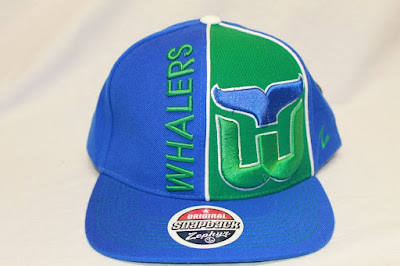
 First, the Hartford Whalers Refresh snapbacks, which are featured in two colorways, right and left. Something is spectacular about the logo for the Whalers - a whale accompanied by "ers." Square brims, green under-brims, dual-colored snaps, and contrast button and eyelets are among some of the notable characteristics of this Refresh snapback.
To the right is the Hartford Whalers Swoop snapback, a gorgeous two-tone snapback with a finely-embroidered script that has a swoop. One thing that struck me was how well the team colorway flows with the design of the swoop: it's clean and simple, yet unique and high-quality. Other noteworthy qualities include the contrast button and eyelets, square brim, green under-brim, and one-colored snap.
Is the snapback hat above eye-catching or what?! This Whalers Splatter snapback features a paint splatter on the brim and button as the main quality; however, a white and green snap is another noteworthy characteristic. Also on the back is the raise-embroidered word "Whalers."
 To the left is the Whalers Hype snapback, a hat with a number of different unique features. To begin, it has a white piping around the front right panel, which acts as a separator to the dominant blue crown. The script and logo are raise embroidered, while the "Z" on the side is regularly stitched. On the brim, eight lines of contrast stitching are used, which is an unfamiliar quality. This snapback design also has one-colored snaps, square brims, and green under-brims.
To the right is the Whalers Gotham snapback, which fits this snapback design because of the dominant black color on this hat. This design has a tall, raise-embroidered script that says "Whalers," and a regularly stitched word "Hartford." Unique to this style is the embroidered logo on the top of the brim, which is done in the teams color. This snapback design has a black snap, black button and eyelets, green under-brim, and contrast-stitched "Z" on the side of the crown.
Above, in succession, is the Original Blockbuster, the Blockbuster 2, and the White Blockbuster 2 for the Hartford Whalers. The key difference is this: the Original has round brims, a transparent script, while the other two styles have square brims and a solid script. All have one-colored snaps, green under-brims, and contrast button and eyelets.
Left, the Whalers Shadow Script snapback, another two-tone snapback with contrast button and eyelets. This snapback design has the slanted, cursive script accompanied by a shadow (who would have thought?) and one of the Whalers logos. All the other common characteristics of Zephyr snapback hats are featured on this design.
Below, one of the colorways for the Whalers Superstar snapback: the picture clarifies most questions as far as logos, scripts, and colors go.
Right, the Hartford Whalers Razzle snapback, a dazzling two-tone snapback design meant to grab attention with the razzle script. Also placed on the crown is a Whalers logo and the stitched "Z." Other unique qualities include the square brim, green under-brim, dual-colored snaps, and the raised embroidery of the script and logo.
Among other Whalers hats that I did not include in the post are the Headliner, the Equalizer, and many more, most of which can be seen in the Whalers section on Hatmonster.
Be sure to like Zephyr on Facebook, follow them on Twitter, and check out our website!
Among other Whalers hats that I did not include in the post are the Headliner, the Equalizer, and many more, most of which can be seen in the Whalers section on Hatmonster.
Be sure to like Zephyr on Facebook, follow them on Twitter, and check out our website!


No comments:
Post a Comment