The University of Colorado Zig Zag snapback (right) is unique because it is not seen very often. Zig Zags can be found on Lids.com but only come in round brims. However, the Zig Zag should not be confused with the CU Upshot snapback, above. Some characteristic of all Upshot snapbacks include the square brim, grey underbrims, and one-colored snaps. I really like the Upshot in Colorado's colors.


To the right is the original Blockbuster snapback, and to the left is the Blockbuster 2. The main difference is that the Blockbuster does not feature the filled-in coloring or square brims that the Blockbuster 2 has.
To the right is one of Zephyr's newer design snapbacks for Colorado, called the ReVault snapback. ReVault snapbacks feature an retro logo that the school has used in the past; I am not sure how old this logo for the University of Colorado is. These snapbacks feature square brims, green under-brims, and dual-colored snaps. I really have come to enjoy the ReVault snapbacks because of their old-school designs and the incomparable quality that Zephyr makes them in. A similar style and design from Zephyr is call the Sideshow snapback, which can be found on the Fanzz website and in their stores.
Zephyr Solid Headliner snapbacks have come to be one of my favorite snapback designs because of the outlining of the raised embroidery that makes the embroidery stand out. Neatly placing the schools name in cursive, the Solid Headliner also includes the mascot above in small capital letters. Features a square brim, green under-brim, and dual-colored snap. There are three different versions of the Headliner snapbacks that are further explained and illustrated in this blog post: Zephyr Headliner Series.
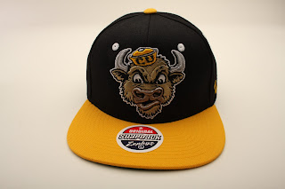
The University of Colorado Refresh snapback features a closer view of the Buffaloes logo, as well as a square brim and green under-brim. One popular aspect of snapbacks I have realized is the two-colored (or dual-colored) snaps in the back. This CU Refresh snapback has a yellow and black snap. Above the snap is the raise-embroidered word "buffs".
 To the left is a retro-styled CU Supersonic snapback. These were only made in round brims, green under-brims, and one-colored snaps. While the design is capturing and attention-grabbing, the Supersonic is not seen very often, at least for me. The more I talk to people, the more I think that Zephyr would make another line for this style with square brims.
 Lastly, the CU Shadow Script snapback is another clean design from Zephyr that has the word "Colorado" slowly decrease in size as it flows across the the front of the crown. There is also a shadowing script that flows behind the original lettering. The Buffs logo is located under the smaller part of the script. The snap in the back is black.
Because I do not post as often on this blog, be sure to check out my website for hat reviews and other Zephyr-related information.
 Above, the Colorado Equalizer snapback, features raised embroidery on the outline of the equalizer, as well as the block script underneight. As you can see, the undervisor is authentic green, the snap is one-tone.
Left, the Colorado Square Brim Fitted. This two-tone hat has the raise-embroidered standard logo on the front, and a simple script on the back. No contrast button or eyelets.
 Above, the CU Buffs Predator snapback, which features a lion-like design on the brim. As pictured, the hat features a two-tone snap and raised embroidered on front and back logos. A hat very similar to this picture right, a Refresh snapback with a Xline logo of Ralphie, CU's mascot. This hat is essentially the same as the Predator except it doesn't have an animal print on the visor.
 Above is another Refresh snapback featuring the exclusive Ralphie design, except this time it's in CU's vintage colorway, nuggets blue and yellow.
Left, the CU Gamechanger snapback, a design that looks oldschool because of a logo placed over a broad script. This three-tone snapback features a green under-brim, square brim, one-tone snap in the back, and raised embroidered on the Buffalo logo.
Check out Zephyr's Facebook, their twitter, and their instagram!


No comments:
Post a Comment